| Company | Qonto |
| Year | 2022 |
| Role | Senior Product Designer |
| Responsibilities | Research, UX design, UI design, prototyping, user testing |
| Platform | Web |
The problem
For SMEs and solopreneurs, supplier invoices eat several working days a month: collect and validate them, track payments, export for accounting. Qonto couldn't help. An invoice only existed as an attachment to a transaction, so an unpaid invoice had nowhere to live, and users kept their documents (and their bookkeeping) in third-party tools.
The starting user story: users need to centralize and visualize invoices to keep track of them. The goal was engagement and upsell among solopreneurs and freelancers, measured by 500 organisations manually marking at least one invoice as paid within 30 days of launch.
Research
What goes wrong when invoices are mishandled
- 10% to 20% of late payments are due to incorrect information on an invoice.
- Late payments incur a 10% fee in Europe, plus a €40 fee per invoice.
How users store their documents today
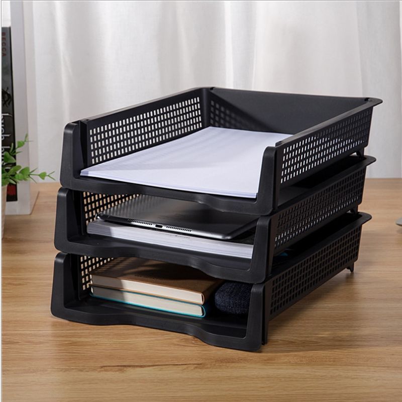
A few users still keep paper invoices, mostly in construction (2% of users). Most solopreneurs keep digital copies (PDF) from email or Slack in a folder on their laptop. The rest rely on pure-play apps such as QuickBooks.

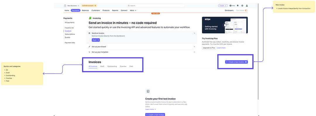
Competitor teardown
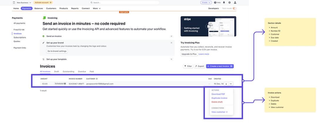
Analyzing our competitors to see what subset of features they had implemented, what we could improve in terms of usability, and to understand product usage from a user perspective.
Defining the solution
Low-fidelity explorations
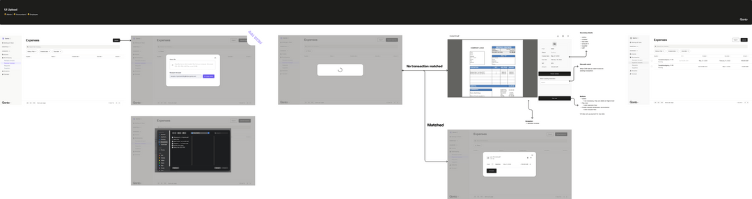
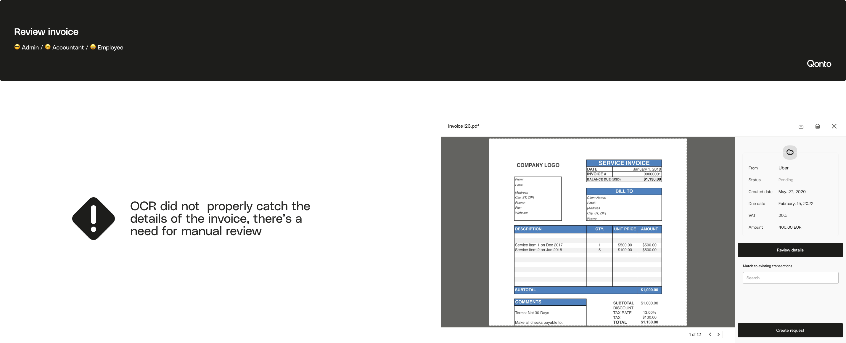
Before any UI decisions, we sketched features and flows in low fidelity to find a possible happy path. Combined with the competitor teardown, this produced five more user stories on top of the original one. Users needed to centralize invoices in one view, collect documents from email, uploads, tax system integrations and scraping, separate paid from unpaid to settle outstanding debt, review and validate details for accounting, repair OCR errors to reconcile payments by hand, and initiate transfers straight from an invoice.

Prioritisation
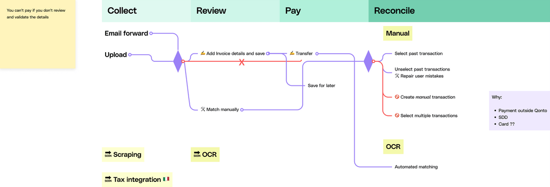
We had six weeks of frontend and backend development, so we grouped the stories into four workflows, each with its own failure mode: collect (capture), review (data integrity), pay (the one place Qonto had a native advantage) and reconcile (matching). Each got its own surface instead of collapsing into one list.
Customer journey
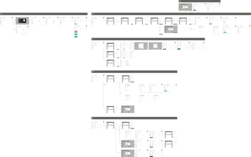
The agreed user journey maps the four workflows end to end. From it we designed a happy path, the quickest route to the user's goal rather than every possible outcome, to guide the prototype.

High-fidelity explorations
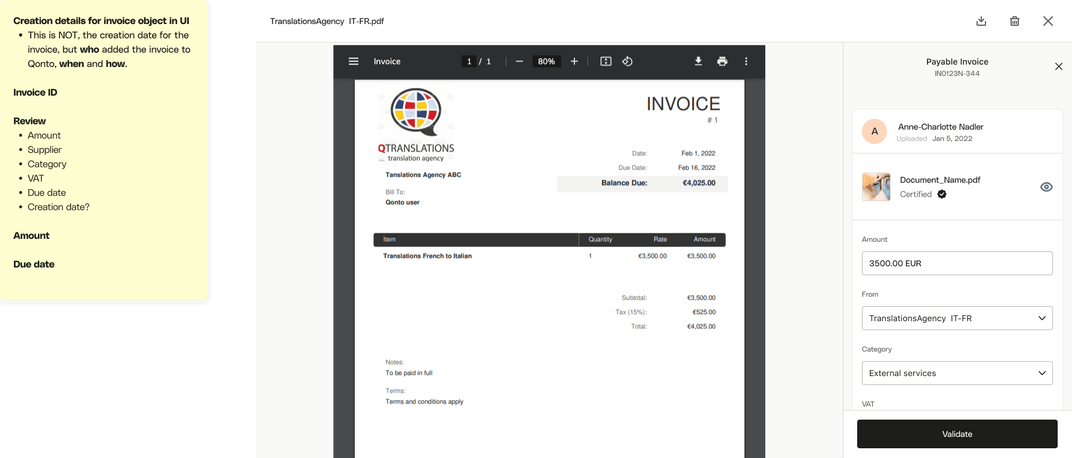
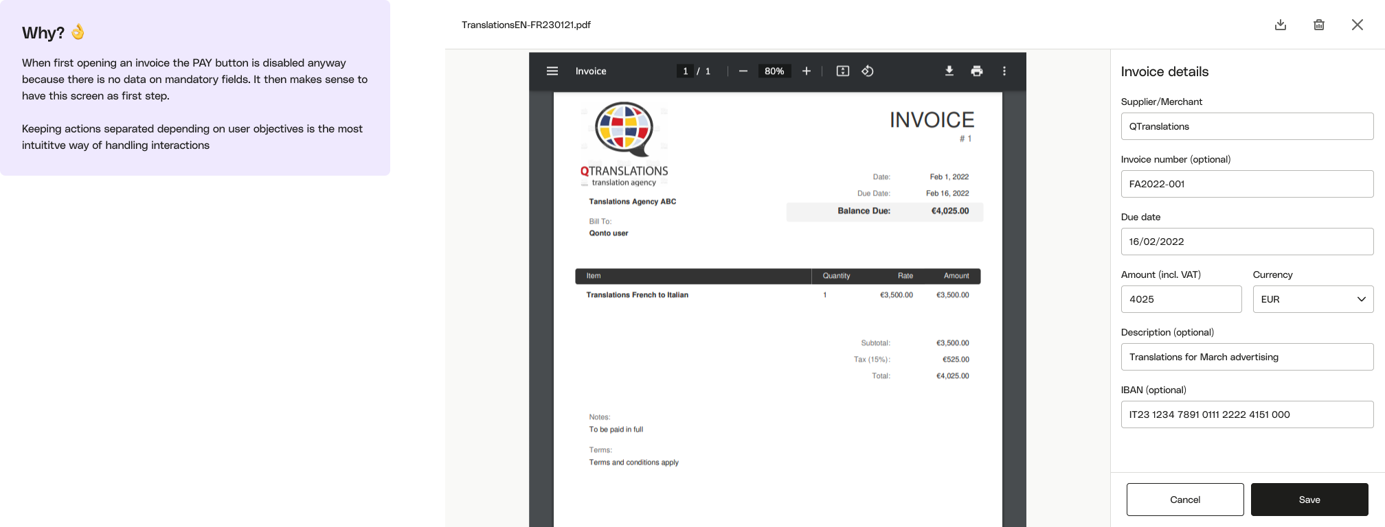
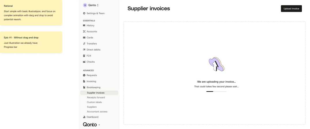
Qonto's design system already had high-fidelity components with all their states, so we explored information architecture, UX and UI patterns directly in high fidelity. The invoice section went through several rounds with the design system team, product managers and frontend developers, and its data requirements became the basis for every later story. For the sidepanel and review flow, the key decisions were how to show extracted data so users could double-check it, and which actions should be primary. For upload, I mapped the file picker and drag-and-drop interactions, plus loading, success and failure states.


Key decisions
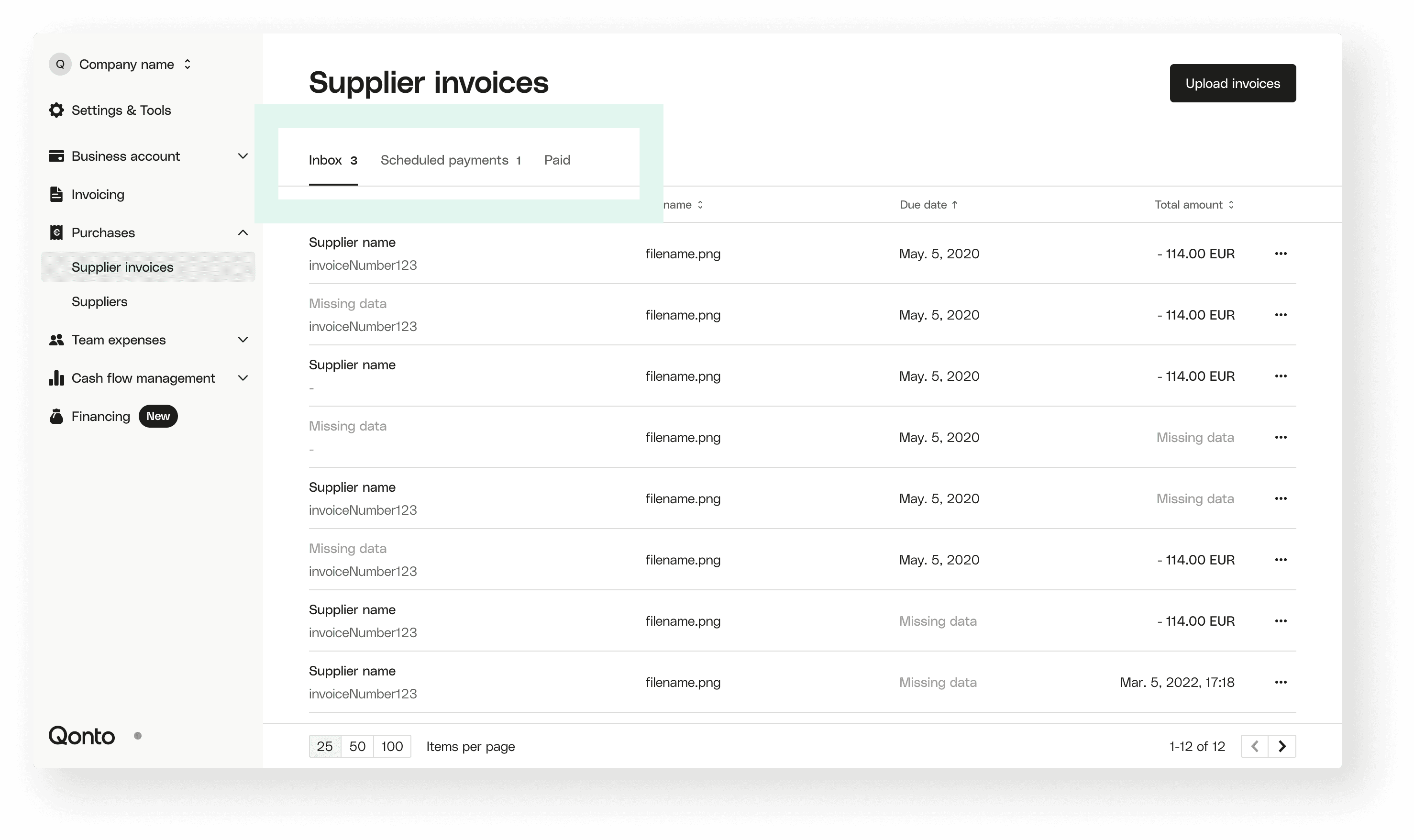
Paid and unpaid as tabs
OCR often left rows half empty, so status had to come from structure rather than data. Some users already sorted invoices into paid and unpaid folders, so we used the same model as tabs. Clearing the inbox reads as finishing a task.
A six-second scan lock
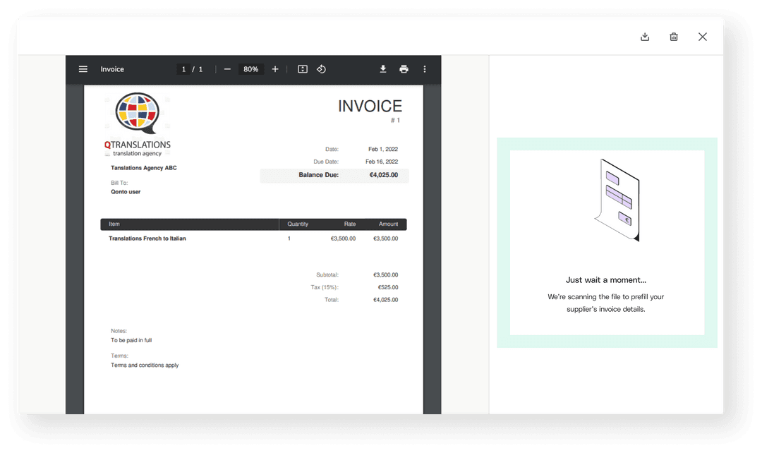
I held the form read-only while OCR extracts the supplier, dates and totals, so the user's edits and the machine's extraction can't overwrite each other and push a wrong total into a payment. One mishandled invoice means a missed payment and a €40 late fee.
Manual reconciliation as a fallback
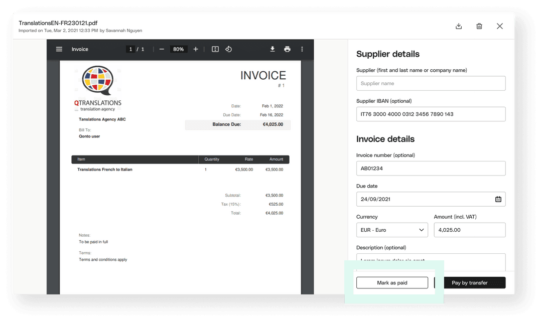
When a receipt is misread as an invoice, a secondary Mark as paid action opens transactions ranked by match likelihood. One action reconciles the pair and flips the invoice to paid.
Supplier auto-complete
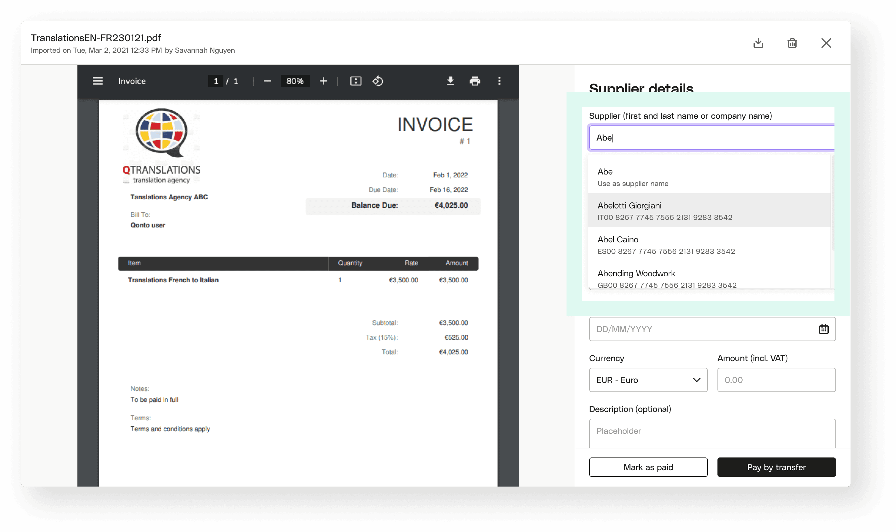
IBANs are long and easy to mistype. Typing a supplier name suggests previous suppliers with their IBAN pre-filled, and collapses different spellings of the same supplier into one record.
Mobile cards that stay recognizable
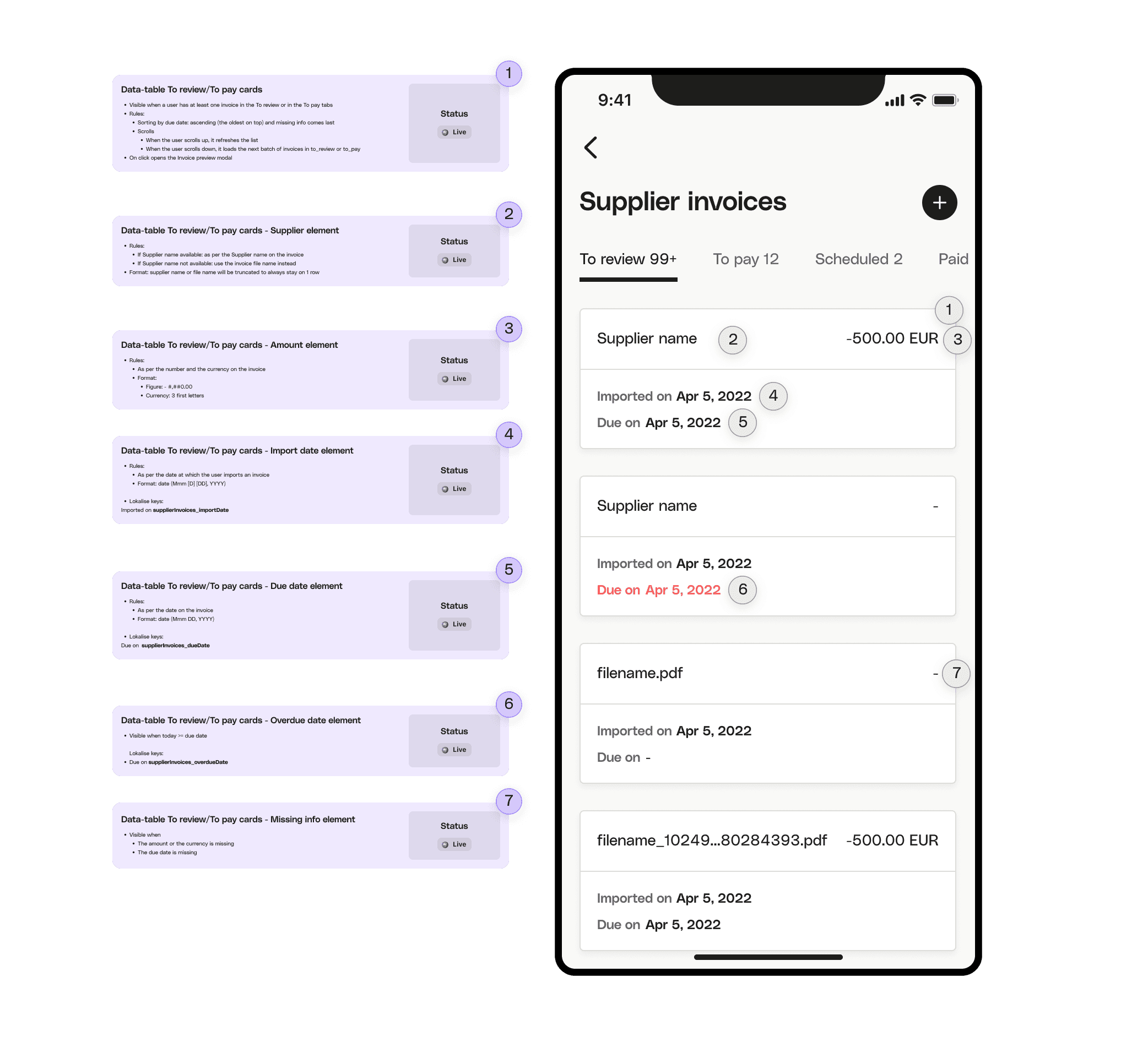
On mobile the priorities were capturing invoices fast and finding them again. Every card element is specced so invoices stay easy to tell apart, even when all we have is a filename.
Prototype
We iterated several times to provide a prototype of the full experience that was aligned between the product, design and tech teams.
Results
We reached our goal: 500 organisations marked at least one invoice as paid within the first month.
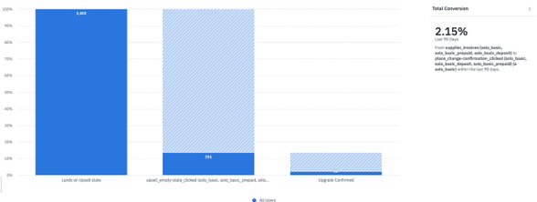
We also drove 52 pricing plan upgrades from Basic to Smart+ in the same timeframe. These are counted only from our new landing page, without considering upgrades that happened from other touchpoints.